


As a SaaS Tech founder, your every day is spinning plates, you're spearheading product development, pinpointing market opportunities, and forging vital partnerships.
Budgeting isn't just a task—it's crucial for your growth strategy.
Your team isn't just employees; they're the pillars of your vision and culture.
Customer satisfaction? Non-negotiable. And technology isn't just part of your operations; it's what keeps you ahead.
Your focus: making swift, informed decisions that drive your SaaS company forward.
However when everyone has gone home, the lights are off and you are still pouring over the data…..when you ask yourself this question
”do I really trust your data?”
What's your honest feedback?
How many time have you asked
“I wonder what our competitors are performing like on this metric or this area”
If you had a dollar everytime you wished you could compare your own performance, not with broad industries that are not remotely associated with your products development or audience type, but ones that are in your own backyard of competition.
The wait is over and now you can…..
![]()
6teen30 as a Premier Partner of Databox are extending their partnership to bring you a benchmark study, one that is built exclusively for SaaS and Tech organizations titled Sales & Marketing Benchmark Group for SaaS / Tech Companies.
We have over 800+ contributors so far (and this is growing daily) to the data set, all from similar niches, the data is totally anonymous, so they like you are not giving any secrets away, you just get to compare your performance against the same type of companies, how cool is that?
You can quickly and easily see where you are leading the pack, where you are stuck in the mud or falling behind, allowing detailed insights on where you need to focus on to become the best in breed.
This is not a one time hit ... .you will after joining i=the group have ongoing access to the data, so you can track your performance vs the benchmark pool of contributors to see if you are maintaining your position, improving or being left behind.
What's the catch?, nothing! It is totally anonymous and totally free!
We have a few examples of the benchmark study that cover key metrics from sales and marketing, before we dig deeper into these, first of all let's show you how to read the benchmarks.
Like anything new, it will feel strange, but it really is a simple set of considerations to get the best from the metrics - here's how.
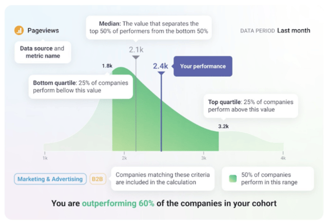
The benchmark metric shows a sample company's performance against similar organizations participating in the same benchmark group.
- Start by focusing on the blue line, this demonstrates 2400 page views of the sample company's website performance against the previous month. When you join our benchmark group, your company's performance will show as this blue line.
- The average value of the performance from the benchmark study shows that this average value is 2,100 sessions.
- The highest point of the dark area curve shows a bigger percentage of the companies contributing peaked at around 2000 page views.
- Either side of this average where the lighter green segments are highlighted show bottom end performance for this particular metric had below 1800 page view and the top performers have higher than 3200 page views.
- The chart is in green because this is an indication this sample company is performing better than the other companies in this cohort, you can see they are outperforming 60% of their competitors.
- If the chart was red, it would indicate that the sample company was performing below the cohort and it would state for example “you are in the bottom 18% of the companies in your group" so you know where to focus your efforts on the metric if its a key one you have identified you need to improve upon.
With a better understanding of how to read benchmarks and before we go and review a few metrics from the benchmark group, if you are ready to join, contribute and compare your performance in the Sales & Marketing Benchmark Group for SaaS / Tech Companies get started by clicking this link.
The study is aimed to serve B2B SaaS and Tech founders with revenues ranging from $1m to $100m and highlights metrics across their marketing and sales performance, here is a few key metrics from the benchmark study that spans a total of 20 separate metrics in the full study, however we are focussing in this blog post around the following metrics to give you an overview of the customer journey performance.
Sessions - A collection of interactions that take place on a website within a specified time frame [Source is GA4].
Bounce Rate - Bounce Rate is a metric in Google Analytics that represents the percentage of visitors who leave a website without interacting without interaction with other pages or elements of the site [Source is GA4].
New Opportunities - New Opportunities metric in HubSpot measures how many new potential customers or sales leads have been created within a specific period of time [Source HubSpot Marketing].
Deals Created - Deals Created is a sales metric in HubSpot CRM that measures the total number of new deals created within a specified time period. [Source HubSpot CRM].
Deals Closed Won - Deals Closed Won is the total number of sales deals that have been successfully closed and won within a given time period [Source HubSpot CRM].
Average Time to Close Deal - Average Time to Close Deal measures the average duration it takes to close a deal, from initial contact to the signing of the contract [Source HubSpot CRM].
Focusing on these six metrics in isolation allows you to evaluate online traffic, marketing and sales conversions efficiency.
Summary:
The benchmark group has currently at the time of writing had 826 contributors, here's the summary of these six metrics median values from March 2024.
- Sessions: 5,091
- Bounce Rate: 49.26%
- New Opportunities: 16
- Deals Created: 41
- Deals Closed Won: 11.5
- Average Time to Close a Deal: 78 days
Looking at a member's anonymized data for privacy, we see the following examples of individual performance against the benchmark cohort on the bounce rate metric.
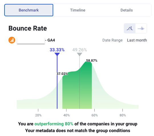
In line with how we read the metrics, using the Hill Chart visualization from a contribution of 816 companies, this company's bounce rate is at just 33.33% as shown in the blue line and is outperforming 80% of the rest of the companies on this metric.
Breaking this down further we see:
- Left side (Light Green Area) Lower Bound Area reporting approx 37% of companies with a bounce rate range of 10% to 37.02%.
- The first quartile (Left Side Darker Green Area) reporting approx 13% of companies with a bounce rate range of 37.02% to the median 49.26%.
- The second quartile (Right Side Darker Green Area) reporting approx 8% of companies with a bounce rate range of 49.26% to 58.87%.
- Right side (Light Green Area) Higher Bound Area reporting approx 42% of companies with a bounce rate range of 58.87% to 100%.
Summarizing, if you have a bounce rate better (lower) than the median 49.26% you are in the top half of the group.
Now let's look at a metrics where the company is not performing as well versus the group.
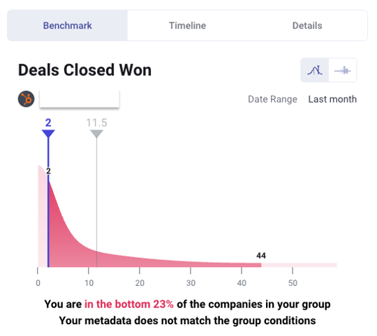
Using the same Hill Chart visualization from a contribution of 236 companies, this company's closed won deal rate reports only 2 deals closed as shown in the blue line and is in the bottom 23% of the group on this metric.
Breaking this down further we see:
- Left side (Light Red Area) Lower Bound Area reporting approx 3% of companies with a won deal rate range of 0 - 2 deals in the period.
- The first quartile (Left Side Darker Red Area) reporting approx 10% of companies with a closed won deal rate of 2 to 11.5.
- The second quartile (Right Side Darker Red Area) reporting approx 30% of companies with a closed won deal rate range of 11.5 to 44 deals.
- Right side (Light Red Area) Higher Bound Area reporting approx 56% of companies with a closed deal won rate higher than 44 deals.
Summarizing if you have a closed won deal rate lower than 11.5 deals median you are in the bottom half of the group.

Conclusion:
When you join the group (join here), you’ll see performance metrics across 20 different areas and your data will always be highlighted by the blue line, and if the chart is red, it means you are performing worse than the group, and if it's green, better, allowing you to identify how you are performing against similar B2B saas and tech companies in the revenue range of $1m to $100m.
6teen30 are a Certified Benchmarks partner and Premier Partner of Databox, and provide a comprehensive and unique service Performance Analytics as a Service (PAaaS) that not only builds dashboards and reports on marketing, sales and Customer Success departments, we also operate a bowtie model approach (Credit Winning by design) - to track revenue through your entire customer journey. Plus we partner with Insycle to ensure data hygiene, modeling and segmentation is achieved to ensure your Databox boards report accurate data.


%20-%20Teal.png?width=500&height=130&name=Force%20%26%20Friction%20-%20Branding%20-%20Logo%20(White)%20-%20Teal.png)